Apart from being a dark song, I'm loving this video for being a throwback to the 80s with it's Aha vibe.
Nice work and in a seemingly typical creative style inseparable from this genre of music now. Bad thing? Hope not.
Wednesday, 29 October 2008
Chromeo - Momma's Boy
Tuesday, 21 October 2008
Arrested Development
 It's been time since my last post . . . uni has been a bit of a joke, tonnes of work n stuff. Literally non-stop, I feel like a grown-up.
Anyway, as part of a relaxation plan, to stop me from going completely mental from all this work, I've been watching Arrested Development. It's my new favourite thing. I pair it with the same style of Curb Your Enthusiasm, but with a bit more of a Gervais-esque humour at some points, particularly in the second series. Basically it's class and I'm sad it's over :(
Alas I shall move onto Curb again.
Friday, 3 October 2008
Letman
 This bloke is class. He does typography for fun. His lettering tantalises the eye. He does the best illustrative pieces and the best standard pieces. This man's gotst skillz.
www.letman.com
Sweet ass record sleeve
 Bought this sweet bit of record sleeve design in Oxfam about a month ago. Its from 1981! I haven't even listened to it yet, but just fell in love with the design. I didn't know they could achieve this type of thing in the 80s? aha. Got the whole Charlie Fanclub/datA vibe to it. I really need to get on this type of design, learn how to do it properly like.
David Thorpe
 That's made from paper that.
David Thorpe is immense. I first discovered him in year12 when i was researching collages for a prosepctive art project. I went to the Saatchi gallery, saw his work and fell in love with it. He uses humble media to create these illustrative yet strikingly realistic collages and sculptures and to convey a sense of utopia. Truely original work and a far cry from the collage work of Matisse or Schwitters. I love it.
Supersonic - visuals for music
 I love looking at how music can be visually represented. This book is kind of my Bible (next to Hand Job of course). Created by Die Gestalten Verlag (Berlin), this manual comes full to the brim with record sleeves, CD designs, posters and video stills from every genre of music. I just love to open it and have a look inside, it's like a treat. The cover design is sex too. Eye candy.
Thursday, 2 October 2008
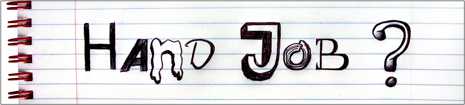
Hand Job rant
 I've been saying for ages now that we need to put down our computer mouse and pick up a pencil. We keep reproducing the same old crap designs. People have forgotten about the principles of design. Since the computer came about, we've even forgotten how to bloody draw or write with out hand too. A while ago I suggested a resurgence in handmade/illustrative design in the world of media/advertising. I expected it to take a while, but it happened sooner than I thought. Now . . . I've gone off it and it's annoying me.
The current advertising campaign for Carphone Warehouse involves felt-tip drawn animations knocking about a white screen to some minimal-techno music. I hate it and I've been trying to figure out why.
Recognising this need for a more 'hands on' approach ages ago was in reality, useless, I'm too young/not experienced enough to actually do anything about it. Now, with all these companies producing these seemingly creative, illustrated, handmade adverts I feel sort of cheated! It's spoilt it for me now. Should it have though?
These adverts that are on now, yes they are different, at least to adverts we used to have, but stuff needs to stand out. What was sacred about it when it was 'undersued' was just that. It was different, original, it had a personal, human touch. Now, being overused it isn't any of those, the quality has been lost, like a Dior design being copied by Primark. Is it a case of trend? Can this go on forever because its 'in fashion' at the moment. Yes, it is 'good' and I do actually like most of it, but is it, in a way, like music? Naively, often once a band or song gets popular, especially if scallywags like it, I find I go off it. Largely, anything is good until it gets too popular and overused. (What was 'in fashion' before this though?) I think it's because it's not original, it's no longer yours. People just 'jump on the bandwagon'. Surely, not all these adverts actually need to be 'handmade'. Do they do their job right? Do they fit the brief? (Sadly the answer probably is yes.) Nokia, Orange and Sony all have these colourful, fun adverts. What is special about them individually? Or is this not actually the problem, is it just me being picky? I mean, they are similar in style i.e. colourful, quirky, fun etc, but they are obviously completely different too. What happened to unique brand identities? If you took away the logo from these ads, you probabaly couldn't tell whose was which. They are almost 'overly creative'. These companies can't all be aiming their products at creative individuals though can they? Maybe if there was an advert for a mobile phone, (I'm using a mobile as an example because creative adverts are apparently particularly rife with this product), that wasn't illustrated or quirky it wouldn't actually stick out because the public/consumer eye is on the current creative, artistic trend. So possibly the consumer is looking for the newest/latest/best creative advert? I can better imagine someone going into school or work and saying "did you see that NEW illustrated ad lastnight?" than "did you see that different one that's not cool because it's not creative like all the others?" It appears to all be about trends here.
What I think we will soon begin to see is pioneers emerging. People pushing the boundaries of illustration and creativeness. Struggling illustrators for years are probably relishing it now because they are finally being accepted. It's their time to shine if you like. I hope these designers, pushing the boundaries, will be seen for being the best, a class above, given credit for not being copycats.
Diana Scheunemann
 This photograph is sick. I love it. And no, its not because this girl has her norks out. In image such as this should be pornographic, but Scheunemann manages to just make it sexy, spontaneous and seductive. Born in Germany and trained in photography in Zurich, Scheunemann has bases in New York, Shoreditch and Switzerland.
In an interview last year in Design Week she said "I move around a lot because you can't do nothing, the more you see, the younger you stay."
I like that.

Wood that we Could
 It's almost a year to the day that this class furniture was introduced to the world, but I thought it was so cool I had to put it in my blog anyway. This series of faux-wood pieces by Richard Woods and Sebastian Wrong was on display at the New York design gallery Moss, a collaboration between the gallery itself and furniture manufacturer Established & Sons. Looks like it's out of a comic book or something, reminds me of the computer game "XIII" as well. Quite illustrative and imaginative I think, and definitely fit.
Thobias Faldt (umlaut over the second a please)
 I first heard of this Swedish photographer back in July when I was on 'iheartphotograph. I checked out his website and found some nicely shot images. His style seems to be very bleek and quite 'cold'. I like it. He's been featured in a tonne of magazines and won a few awards too. He has a quite a nice philosophy that he only takes one photo and leaves it there, he explains it better himself . . .
"i take thousands of pictures but i always stick to shooting only one frame of every photo 'cause i don't know how to choose otherwise. and i can't look at the pictures directly after i have taken them because if i do that i have such a strong feeling of the moment when i took it. it can only be a "picture" for me when the feelings from the moment are gone and all that is left is the picture as you see it. then i can choose. i'm always looking for pictures that have more than one layer of feeling."
I can't help thinking, is his stuff only cool though because it's set in Sweden and that's obviously foreign to us? Anyway, have a butchers . . .
www.thobias.se
www.iheartphotograph.blogspot.com
Glow Worm
 Found this typeface when I was flicking through one of my brothers' old crappy type folders from secondary school. Would be a nice typeface to reproduce by hand with an illustration piece. I like the rounded, shiny ballooniness. Quite playful.
Wednesday, 1 October 2008
Michel Gondry
 Michel Gondry is mental. He makes truly unique and inspirational work. I first heard of him when I saw the video for Daft Punk - Around the World and instantly looked up to see who made it. I found that Michel Gondry in fact made a LOT of music videos and even adverts and films. His videos are very creative, artisitc and even childlike. He has a crazy imagination that makes you think this guy has got to have done a lot of drugs in his life. I'd happily be a crack addict if my portfolio looked like his though. Literally all his videos are excellent. He has made music videos for the likes of Beck, Bjork, Foo Fighters Chemical Brothers to name but a few. I recently saw one of his films The Science of Sleep which was very surreal and ingenious. He is also the man behind Be Kind Rewind, a film which take son the recent craze of 'sweding' to a whole new level.
Introducing . . .
 My mum bought me this set of books about 5 years ago. I have only recently read them. Despite their cheap appearance these books provide a helpful insight into those kind of things you wish you knew about, but don't have the time to properly read up on. For example, I learnt everything I needed to know about Freud and penis envy in just a few hours. They've been a great help to my course as well, providing me with knowledge in varying things that could easily be related to graphic design or affect esign. I think there are many other volumes in his range too, I may invest.
Dean Rogers
 Dean Rogers is a great photographer. He mainly does film photography for the likes of his mate Shane Meadows. His portfolio up to date includes iconic photographs for gritty Brit dramas like Control, Dog Altogether and This Is England. His photographs capture the essence of the films and highlight poignant moments with brilliant skill. He has also done several commissioned works, my favourite being 'World Cup', a great idea. Check out his online portfolio.
www.deanrogers.co.uk
The Life Aquatic
 I'm not Wes Anderson's biggest fan, I mean I don't mind The Royal Tenenbaums, but I could never really get into it. However, The Life Aquatic is brilliant. It' one of my favourite films. My adoration of this film is largely down to Bill Murray's performance as the ageing sea explorer Steve Zisou, but this film should be credited on many other levels. The script is subtly hilarious, the filming and directing is excellent, the little animations throughout are quirky, the repetitive backing track does not get boring, but rather adds to the film's strange pace, and just the overall plot and narrative is genius. Seu Jorge's acoustic Spanish(?) covers of Bowie songs is a particular highlight for me too.
Nice.
SO ME
 SO ME is another French graphic designer/illustrator(/DJ). His rise to fame is mostly due to working for the popular electro record label 'Ed Banger' for which he designs each artist's record sleeves, merchandise and most videos. The style he employs in his work is nothing technically challenging, rather standard vector stuff on Illustrator/Photoshop, but it just looks great.
He won the MTV video award a couple of years ago for Justice vs Simian - We Are Your Friends and if you ever saw the awards you probably remember Kanye West being a douchebag and getting on stage saying he didn't deserve it. (Basically Kanye West's DJ, A-Trak, told him he was being a douchebag and SO ME and Kanye ended up making a video together). . .
He also made what I believe to be the best video of last year, Justice - D.A.N.C.E. in which the two performers in Justice are filmed from the neck down walking along to the beat of their song as the graphics change on their t-shirts. It's unique. His illustrations have resulted in becoming the artists' 'identities' if you like, most notably the iconic Justice 'cross' and Sebastian's 'face'. There's something just extremely aesthetically pleasing about his designs, particularly on record sleeves and t-shirts. The illustrative type and illustrations themselves just work well together and lend themselves to the genre so well. Well, actually, as fromage as it sounds, it could be seen as the other way around. SO ME has almost defined this genre of music with his designs. (The two go hand in hand, like music/fashion - which one follows the other?). There is a 'class' of person now, like a chav or emo, who you can tell likes electro because they are wearing an Ed Banger t-shirt. You see these hoards of fans jumping up and down at a Justice gig, waving homemade illuminated 'crosses' and think they're all grouped together not only by the genre of music, but by the design and they probably don't even realise it. Or maybe they do? Maybe the audience are more active and intelligent than I give them credit for. Is it a choice? Do they say "I like this design. I like this music"? Hmmm.
I think it's true to say SO ME has captured a generation with his illustrations and design, much like you would say a photographer had "captured the seventies" or something. It's what the industry needs right now, it's just a shame I didn't get in there first. He has inspired me to do more t-shirt designs and doodle.
www.myspace.com/20399307
www.arcademode.com
p.s. check this website out for some humourous portraits SO ME did of Ed Banger boss, Busy P and scroll down to get more of an idea of what he's about.
www.studio.to/gallery.html
Tuesday, 30 September 2008
Mr. Charlie Fanclub
 My mate Louis Rodgers aka Charlie Fanclub is a producer/DJ from Derby and apart from being very good at what he does, he has acquired some nice artwork for his single "Nightbreed" released on the predominantly house label 'Work It Baby'.
A 21year old Parisian who goes by the name of 'Empire' designed this new identity for Charlie Fanclub. It just looks pretty cool I think. Some good Photoshop skills with the gold/neon reflecting and glowing effects, much like the 'datA - Rapture' sleeve. Some bon type work too.
www.myspace.com/akadigitalblonde
www.empireisok.com
p.s. keep an ear out for Charlie Fanclub and also have a look at the motion section on Empire's website, nice little video.
Monday, 29 September 2008
Sleeveface
 I saw this epic website quite a while ago, but was reminded of it recently by Smooth Radio's new multi million pound advertising campaign. At first, as usual, I thought they had just robbed this idea, however, a little research tells me that it's a collaboration. This is a difficult thing to describe, but basically sleeveface.com is a brilliant website displaying everyday people's photos of themselves 'making up' the parts of their LP sleeves that are missing. The photo above explains it better than I could ever do really. Well, actually, sleeveface.com defines itself as "one or more persons obscuring or augmenting any part of their body or bodies with record sleeve(s) causing an illusion". The idea transfers across to the music/radio industry with ease, but I find the Smooth FM advert is nothing other than just remotely amusing because it reminds me of Sleeveface.
p.s. there's a Sleeveface book coming out soon showing the best of the images. Expect to find this coffee table item in somewhere like Urban Outfitters.
Hipster Olympics
Been forever since my last post, but I've been moving into Uni again and adjusting to independent life after a summer of (s)mothering has proven quite time-consuming!
Aaanyway I just remembered about this little beauty. My mate Tom Grainger, a cinematography student, posted this as a bulletin on Myspace (R.I.P.) about six months ago. Some brilliant satire, 'it's funny cos it's true'. It's stuff like this that makes my day. If I could inject even a smidgen of this type of humour into my work and get the idea across successfully, I'd be a happy boy, with a nice little portfolio.
Thursday, 18 September 2008
DatA - Rapture
 Popular French DJ DatA, usually known for his remixes, has joined forces with the voice of DFA 1979, Sebastien Grainger, to produce this electro pop belter.
I really like the artwork for this song. Firstly its been designed to look like a dog-eared LP with scuffs and creases over the image. I love the typeface, can't go wrong with a bit of Avant Garde Alternative and it's professionally executed. The reflective gold/silver is cool and the photography is great along with the Photoshopping and overall art direction. I particularly like the puddle reflection and futuristic look. I just find it interesting to look at.
www.myspace.com/0data0
Oatmeal.tv
Russ Tannen and his mate Tom present an online TV show called Oatmeal TV. It's hilarious. They go to various gigs and festivals interviewing acts, asking comedy questions. They are great presenters and come up with interesting intros and filming techniques for each episode. The animations/illustrations are excellent too.
www.youtube.com/oatmealtv
p.s. watch out at the end for "Hi my name's Andy and I'm watching Oatmeal TV" ahaaa!
Russ Tannen photography
 I met Tannen through the Underground Heroes. He's (mostly) a band photographer. I included a colour photograph, but he prefers black and white, or black and wight as he calls it, he's from the Isle of Wight. He got a first in his photography degree. He's good with a camera.
www.russtannen.com
Roy & The City
 I hate Sex & The City, but at the moment there is a cool advert on Paramout Comedy for "the best of Miranda". It's done in a comic book/Roy Lichtenstein pop art style and the parallels between the content and style of the programme and that of the original Lichtenstein art are really strong so the idea is great. It's surprising no-one recognised the similarity earlier.
Monday, 15 September 2008
I'm hating it
 McDonald's board meeting:
"We need a makeover"
"I've got an idea! Let's paint our fascia green and use fancy furniture"
This is bad design. It's immoral! Pretending to be natural, eco-friendly and posh. It's like Hitler wearing a mask of Barbara Streisand. Antithesis much? Surely there are laws against this???
Ideas?
Rory Phillips & Skull Juice poster
 My mate Si Sherlock will be annoyed I found this before him.
This clubnight event poster is really different to all the flyers and posters of the moment. Not only that, it's actually good, the type is well done, the colours compliment each other and the grid system is evident. I'm not usually a big fan of stuff like this, the oversue of the modernistic 'Swiss style' (as I've said before), but I can't help liking what I like at the end of the day!
Pisa
 Shithole.
This place has nothing apart from the leaning tower, which provides about 20 minutes of enjoyment and isn't even impressive. If you're in Italy, only go there for a day trip, its well worth the classic tourist photos though (I hate my life).
Rome, Florence, Pisa . . . . . done.
Florence
 There wasn't much to do in Florence, it was just really scenic. We rented bicycles n went on a ride along the river. The only thing Florence really has is Michaelangelo's 'David'. It was nice to see it 'in-the-flesh', but it wasn't anything special because we'd seen it all before in Rome. It was weird though because David was meant to be a little boy and Michaelangelo made him as a giant muscular figure. Don't know if this was on purpose or just stupid. I'm guessing it was purposefully unconventional.
Rome - interesting poster
 Saw this poster everywhere in Rome. No idea what it's for, but it just looks well cool. Leaves you wanting to know more.
Rome - Schifano
 Scoped out the Museum of Modern Art whilst I was in Rome. Free entry for students! The gallery just had one big exhibition on Mario Schifano. I had never heard of him so was apprehensive, but I enjoyed his art a lot. His works are very large and mainly mixed media - paint on cardboard, collages, acrylic (plastic) etc. Schifano was also a film maker and typographer. I enjoy 'NO' a lot, big, red and angry. The typography in 'Machine' is great and works well on the creamy substrate and in contrast with the black shoe. The other one below (don't know what it's called) just looks like a giant 'A' and just I like it, purely for aesthetics, as with most art. The gallery also had some classic pieces of modern art, like a cool Mondrian I hadn't seen before, a Pollock and a glass cabinet full of Duchamp (shit).
Rome - The Sistine Chapel
 My girlfriend had to close my mouth because I didn't realise I was sitting there, looking up at the ceiling, with my jaw literally dropped in awe. ('Gay', I know)
p.s. photo not actually of Sistine Chapel, but of room nextdoor, lots of guards saying "Noooa photoo" you see.
Rome - St Peters
 Too many steps to the top.
My girlfriend and I got a bit angry in this place. It's amazingly decorated with mosaic, so much so that the ceiling looks like a painting, and the building itself is ingeniously built, like everything else, but we were peeved about one thing. Most of these impressive buildings and paintings and everything we saw would not exist if it wasn't for religion. And this annoys us because we both dislike the idea of religion. Pretty much a catch 22 then. We aren't religious, but most of the most awesome things in the world are.
Rome - The Pantheon
 I reckon this was more impressive than the Coliseum. Possibly this is because it's the best preserved of all the Roman buildings and maybe of all buildings of its age worldwide. All the same, it's epic. From outside, the giant columns that support it's roof just exude 'ancient Rome'. To try and show you the full awesomeness of the inside, I made an attempt at a mini panoramic image, collaged on Photoshop. The ceiling is a giant dome with a big hole in it basically. And it looks wicked. Now this was ORIGINALLY built in 27BC as a temple for the gods and then was rebuilt in about 125AD after it was destroyed in a fire. This was built 2000 years ago! Builders today couldn't do this, fucking cowboys. The intricacy of it's design is mesmerising, involving wooden moulds, scaffolding and 6metre thick walls. It's massive.
Rome - Trevor
 The Trevi Fountain is probably the best fountain ever. Charlie Dimmock ain't got shit on the Roman's. We saw it at night time and it was full of tourists. This fountain is huge and it' so impressive when you think about how they built it and how the sculptors had to consider where the water would come out of on each figure. Roman's love fountains, they are bloody everywhere. But none quite as cool as this one.
Rome - The Foot Museum
 Not actually a foot museum, but it did feature large foot statues. This place, AKA Musei Capitolini, was impressive. It was full of incredible statues. The best was the colossal statue of Mars (pictured above). Even though it was in pieces, you could imagine how big it would have been standing. I said to my girlfriend that the Roman's were crap at proportion accuracy because his feet were somewhat smaller than his face. However, she was quick to put me down by saying that was on purpose so that when you look up at it, it is actually proportioned to the eye.
 Type was another great thing. It's mental to think that the ancient Romans' had typography skills. This tablet shows knowledge about kerning, serifs, x-heights and so on. I guess the Romans pretty much invented standardised type? (Actually no they didn't, it had something to do with the Greeks, welllll BC I think). The typeface itself, elegant and attractive. The 'Q' is fit. This stuff has to be seen to be appreciated, you can read about it in books, but you just don't think about it in the same way as when you see it for yourself, in situ.
Sunday, 14 September 2008
Rome - The Coliseum
 Like most sites I seem to go and visit, the Coliseum is not as big as you think it's going to be. It looks muuuch bigger on Gladiator aha. (maybe its just me though, I thought the Empire State Building wasn't that tall and it was in a cloud). After being accosted by a deaf and dumb Roman soldier, having our photos taken, and being stripped of 4euros for them, my girlfriend and I made it inside. After my typical initial reaction, I did then think that it was actually immense that they built this tiiime ago, sans powertools. This was a recurring feeling throughout my 'Roman Holiday'. Inside the edifice, it was actually quite gigantic and impressive, you could see how people would have interacted with it centuries ago. It was bigger than Old Trafford I would say. The best bit was being able to see under the ground, where all the animals and gladiators were kept before fighting, I got excited like a small boy, thinking of the film Gladiator.
Rome
 Photo by my bird
Romans take the piss when it comes to taking advantage of tourists. I thought England was expensive! For 20euros you can get the cheapest wine in a cheap restaurant and enjoy its vinegary flavour. Spoke to some nice Italian bloke though who told us they have a 20% tax on alcohol over there so no wonder. Food was dear too though.
Other than that, Rome was lovely. You can see why tourists flock there. It's beautiful. Everything is old and huge. The 'wow' factor I felt though dissipated somewhat for the fact that EVERYTHING was that big and spectacular, it lost its uniqueness and became samey and we ended up speeding round Rome, only occasionally stopping for a special jaw-drop. I'd say you would have to go there before you die though, because it is so old n cool, you cant help but be flabbergasted (awesome word) by it.
p.s. we spoke to an English/American couple who worked for Adobe one night, got some inside scoop, sworn to secrecy like though. READ MORE...yes please!
Italy
 Got back from Italy a couple of days ago so I'm going to write about my experiences there one by one whilst they're fresh in my memory, then I'm going to have to backtrack to Valencia, Liverpoool etc, not enough time to write things as they happen you see. I went with my girlfriend for six days and we visited Rome, Florence and Pisa. There were much more touristy things to visit in Rome (and therefore write about) than Florence or Pisa, but Florence had a much nicer vibe to it. We squeezed everything in. It would have been nice to go on some guided tours and learn a bit more about each place we visited, but being poor students, we could not afford.
Wednesday, 3 September 2008
Letraset
 Now doesn't that just look so fit.
I've only just remembered about these babies.
My mum used to give me sheets of Letraset to use when I was in school. They were the best thing since sliced bread, that was until Satan, aka the computer, came along. Pages and pages of transferable type, simply scribble over the top with a pencil and it presses right through to your paper. Genius.
The typography, colouring and layout on this piece is astonishingly attractive.
Good vinyl
 Vinyl records are so effing sweet.
They look sex.
I think it's the squareness of them or the size, but they just beat the shit out of CDs and especially invisible MP3s. My speakers for my decks have been broken for a year now and I still buy vinyl. It's kind of nostalgic, I just like taking them out of me box and looking at the covers. I have a penchant for vinyl charity shopping too. Got me a copy of Madison Avenue - Don't Call Me Baby the other day!
Playing a record too. I mean . . . it's like farming your field, riding you horse n cart to Ye Olde Pub, having a tankard of ale and going home to your good lady wife for a ploughmans and a roger.
Classic.
What's the chuffing deal Noel?
 What are these fucking 'designer' vinyl toys that have been getting in the way of my life for a couple of years now???
They are poor. They aesthetically please me for like a second and then I want to melt them like I used to do so to Playmobil with my mate Magor (Playmobil was awesome though, they didn't deserve the melting).
Who decided to make 'nice looking' toys for adults, that aren't toys, but in fact just sit there on your shelf, or probably in clear vacuum formed containers, looking shit? They aren't Pokemon cards ok? And you aren't a child, so you don't need a pretend toy. It's not 'kooky', it's stupid. At least Pokemon cards were cool (yes i do still have the complete original base set in plastic card-sized wallets, there's just something about shineys!!!)
So yeah, just what's the deal here? This designer toy explosion needs to im-fucking-plode.
The Japanese had a good thing going with karaoke and they ruin it all with this.
VICE magamazine
 Vice is cool.
A free magazine, full to the brim with hilarious, zaney and extremely interesting material.
The copy in each editorial and the website is just 'the best'. Its so witty. Great photography, illustration, fashion, music and unique articles fill the pages. Its a good cultural read with lots of eye and brain candy. Be sure to read the "do's and don'ts" section, I'm reading some now, they're fucking hilarious. Go to your local hipster shop or local record store and invest in a free copy of Vice today. Also visit the website . . .
www.viceland.com
p.s. I'm doing a mini photography project for Vice at the mo, as well as do's and don'ts photos, saweeet.
Underground Heroes
 photo by Russ Tannen
They hail from my great hometown of Chatham, yes, where the word chav comes from. Their local, the TapnTin (infamous comeback gig venue for the Libertines), their genre . . . hard to define. Best way of putting it is indie-chav/punk/ska.
They're set to be big, you have to see them live, people love it.
"The Jam if they'd read the Razzle instead of books on politics" - NME
"Million miles an hour cocky-yet-witty-with-it-lad-punk - in the best possible way" NME
www.myspace.com/undergroundheroes
www.last.fm/music/Underground+Heroes
p.s. their Jamie Reid-esque logo is something to be admired too. READ MORE...yes please!
Sunday, 31 August 2008
The Sculpture Diaries
 An interesting new progamme started on Channel 4 tonight, The Sculpture Diaries. First in a 3-part series, this episode explored the world of the female form, the most popular subject of sculpture.
An LA ex-plastic surgeon 'found' a mathematical mask of beauty similar to that of Pythagoras' Golden Section and The Fibonacci Series. It was amusing to see him make Victoria Beckham beautiful on photoshop. He mentioned something which I too believe, survival of the fittest. It IS related to beauty. The more beautiful of people will be attracted to each other and produce offspring so over many years, the human race should be more 'perfect'. An interesting Darwinist concept to consider. The last thing to be discussed was the darkest of the dark, the sculpture work of Hans Bellmar who would rip apart dolls and reposition their bodily parts. I was fortunate enough to see a piece of his work, The Doll, in my recent visit to Liverpool Tate. However, it seemed more comical and 'bubbly' than horrifying to me.
The Sculpture Diaries had some annoying over-the-shoulder filiming of the presenter, yet included some great techniques too, such as a perspective pull-focus shot between the Venus de Milo and a small, restored replica. The titles/graphics were so poor that they depreciated the entertainment for me, although the content alone held it together. It was interesting and enjoyable to watch and I leanrt a lot. I now have a new found respect for sculptures.
Watch it on 4OD and next week on TV.
p.s. Google statuephilia
READ MORE...yes please!
RE BA JAS

I pilfered this rather eye-catching poster from an old-ladies shop in an Il Corte Inglais in Valencia this year, with the aid of my miniature girlfriend. It had caught my eye a few days previous when me and my mate Si Sherlock were wandering. My girlfriend and I executed the steal in a Bond-esque fashion, hiding behind clothes rails with lookouts etc. It was a two-man job. More Ace Ventura than James Bond though actually. It was risk because Spanish police love a good beating, but it was worth the gamble. My girlfriend's GCSE Spanish informs me that 'rebajas' means sale/reduction.
The simplicity and cheapness of this A2 poster is what primarily drew me to it. The vibrant primary colours and chunky type work great together and whoever made it deserves a pat on the back because obviously, being just a sale sign in an old-biddies 'fashion' shop, it's going to have been cheaply designed and produced. Generally I'm not a fan of minimalism, but for this I can make an exception. It just looks cool. And I can't wait to frame it and find a bit of wall space to stick it on.
A good bit of type.
READ MORE...yes please!
Thursday, 28 August 2008
Fred Perry
 I love Frez Pez.
I am not sure when my adoration sprang its roots or how exactly, I think my mum used to dress me in it as a sprog actually, but I just bloody love it.
The design is so simple and quintessentially British. Garments can be worn as casual clothing or smart. It's sport-fashion, but not Reebok Classics (blud). Today it caaan be seen as chavvy, I don't think it is, but even so . . . whatever . . . 'salt of the earth' innit.
The flagship store in Covent Garden is clean cut and symmetircal, displaying giant 'crests' over the walls. This too, the logo, is iconic. Distinguishable anywhere.
After its original sport purpose, Fred Perry was quickly picked up by the music scene and associated youth culture, most notably of which, the 60s and Mods. Yet, it also stretched to the 90s and Hip-Hop and today its mostly paralleled with what I suppose is 'the Hipster' (?), pretty much everything that isn't chav, style-idiot and ghetto.
I like.
Wednesday, 27 August 2008
Dave Naz (and Ashley Blue)
 This is weird. Don't ask me how I got to finding this website, I can't remember, but I do know it cropped up when I was on the Vice website or something a while ago.
Dave Naz is a photographer. Ashley Blue is a famous pornstar. They are boyfriend and girlfriend.
Their blog diarizes their life, written by Ashley Blue and photographed by Dave Naz. It's not for the faint-hearted. There is some filth in there, but some cool photos like the one above. They seem to lead a very normal life, however this interjected by watersports (the sexual kind) and an over-affection for pets (the non-sexual kind).
Even if you don't like the photography or the smut, I think you'll find that the life they lead, day-to-day, is really quite interesting, its like reality TV, but not complete shite.
Visit this link for one strange, genre-defying, yet culturally intriguing hell-of-a-blog:
www.davenaz.com/ashleyblue
p.s. I'm not a perv.
READ MORE...yes please!
Apple iPhone 3G
 So, it's been 3 years since I had a 'new' phone due to alcohol enthused beach walks, showers and thieves. I invest in this.
The iPhone 3G is epic. Aesthetically it ticks my boxes - small, dark and handsome. Function wise, it's touch screen . . . TOUCH SCREEN! That's like, the future! The 3G thing means I can access the internet anywhere, anytime too. I have only had it 4 days and it's already made my life easier . . . on my way back from Liverpool I did some much overdue networking on Facebook and answered some emails. The battery life is surprisingly good. It has an iPod built in. It has 'sat-nav'. A notepad. A calender. You can download tonnes of free add-ons, my favourite of which is the strobe-light aha! It's 16GB so I can fit lots of music into the in-built iPod.
Oh and it's a phone.
READ MORE...yes please!
Yes, the adverts have got quite tedious. Forget this and go out and buy one. Not even hat expensive now either. Here is the beginning of my post.And here is the rest of it.
(I do realise it's only been 4 days though, expect another post within 18 months 'effing' and 'beeing')
Calm Down

photo by my mate Si Sherlock
Yes, it's been over two weeks since my last entry, but it's summer (apparently) so leave off.
Anyway I have spent the time effectively, collating more interesting stuff, got an iPhone, seen some films, listened to some music, been to some nights, been in discussion with Vice magazine and seen the world. AND I even travelled to Liverpool to see the Gustav Klimt exhibition at the Tate. There's lots to say about Liverpool, not yet though and I also can't delve into the Klimt exhibiton yet as my girlfriend has my material on it.
The point is . . . you need to take a break. I used to be extremely lazy, now I'm the complete opposite . . . I can't fit everything in. You can't win. Before this (unintentional) two week 'break' I was stressing over work and extra curricular efforts and life etc. etc. and, well, yes I still am now, but it's nice to distance yourself from it for a bit.
Go somewhere and do something.
p.s. also, invest in a hammock.
READ MORE...yes please!
Tuesday, 12 August 2008
Core 77: Hack 2 School
 This interesting website popped up when I was carrying out some research on God-knows-what about a year ago. Produced by the online magazine Core 77, it's a very helpful and occasionally amusing resource aimed at helping design students. Core 77 itself was set up in 1995 (possibly one of the oldest online magazines in existence) by two design students as their graduate project and it has flourished from there.
The website provides advice on such topics as choosing the write pen to choosing the best camera, 'style block', how to build a good portfolio, Photoshop tips, blog tips and how to lead a woe-free life as a design student, among others. It's got a bit of everything you could wish for basically and has certainly helped me a few times.
Make sure:
a) you go through each of the five page headings: classroom - dorm room - represent - crash course - cheat sheet.
b) you look at the 'Classroom Desgnertypes' entry! Which one are you?
Check 'em out . . .
www.core77.com/hack2school
www.core77.com
READ MORE...yes please!
Monday, 11 August 2008
Dog Altogether
 This July I decided to go away with my friends to a music festival held in the small seaside town of Benicassim in Spain. I was busy sunning myself at the beach on the Sunday of the festival when out of the corner of my eye I spotted a man in scruffy work boots, baggy shorts and a blue short sleeved shirt jumping up and down on the spot. I kept one eye on this man whilst I applied some suncream and as he ceased to jump and began to walk up the beach in my direction I noticed that both he and his companion donned VIP passes. I immediately began studying the gent's face. In shock and awe I instantly rose to my feet and in a style not unlike that of the gay friend in Bridget Jones ("Fight! It's a reeeal fight!") I exclaimed to my friends, "It's, it's, it's 'touch it'! It's bloody 'touch it'! It's Paddy Considine!" . . .
Yes, the British acting legend that is Paddy Considine was gracing our beach with his presence in Spain. We had just happened to be quoting him all week from his hilarious, yet harrowing role in Shane Meadows' A Room For Romeo Brass, Considine's first film. ("touch it" - my bumbling - is one of the funniest phrases from the film). My friends and I rushed over to him, got a quick photo and an autograph and as we were singing his praises he told us he was at Benicassim to show his directorial debut Dog Altogether in the afternoon. (I thought we were privvy to some international premiere, but I now realised it was released several months prior to July)! We let him stroll off along the beach-front as we gleefully rushed back to our stuff to check our programmes and two hours later we were queuing up for a short film festival in town! We watched five shorts, each about 20mins long, by five different directors/writers including Paddy (first name terms now we're best mates 'n all).
Dog Altogether was excellent. It's a great tale of realisation and regret as Joseph (Peter Mullan), a man plagued by violence and rage, is driven further and further towards self destruction. After a series of violent and irrational attacks in the story, Joseph breaks down and is aided by 'the good Samaritan', Anita, played by Peep Show's Olivia Colman.
Considine is clearly talented as much behind the camera as he is in front of it, and he skillfully directs some emotive scenes. In a pub setting, Joseph' rage is triggered by rowdy young men playing pool. Considine's camerawork visually represents extremely effectively what must be going through Joseph's head as the message is clearly put across to the audience, yet not a word is uttered. The camera does all the work, the sign of a great director I'm sure. Joseph goes to the toilets and appears to psych himself up in a scene similar to that of a boxing movie or even in the Godfather before Al Pacino shoots the Police Chief in the restaurant. Although not completely original, it is still well composed. Another particularly memorable moment is when Joseph finally breaks down and cowers behind a clothes rack in a charity shop. You can't help but feel for him despite the horrible things he has done and it feels almost like he is a child, hiding, sulking or whimpering. An excellent portrayal of the character. It is clear that Considine has learnt from the master, Shane Meadows, and this film's success is as much down to Mullan's great performance as it is Considine's effort, but you cannot fault his work in this film and it is his first venture into the writing and directing world of screenplay. Paddy Considine won a well-deserved BAFTA for best short for Dog Altogether.
Be sure to keep a keen eye out for any future work involving Considine, in particular 'Tyrannosaur', a follow-up to Dog Altogether, in post production at the moment I believe. (Below - my chums and I with Mr. Paddy Considine after the short film thing. Looks like a school trip!)
Subscribe to:
Comments (Atom)